ROLE: CREATIVE / ART DIRECTION / DESIGN & MOTION / COPY
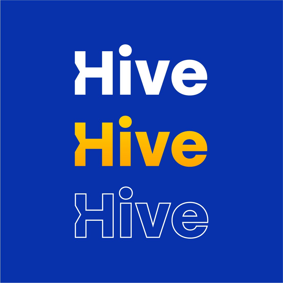
HIVE STUDIOS VISUAL IDENTITY
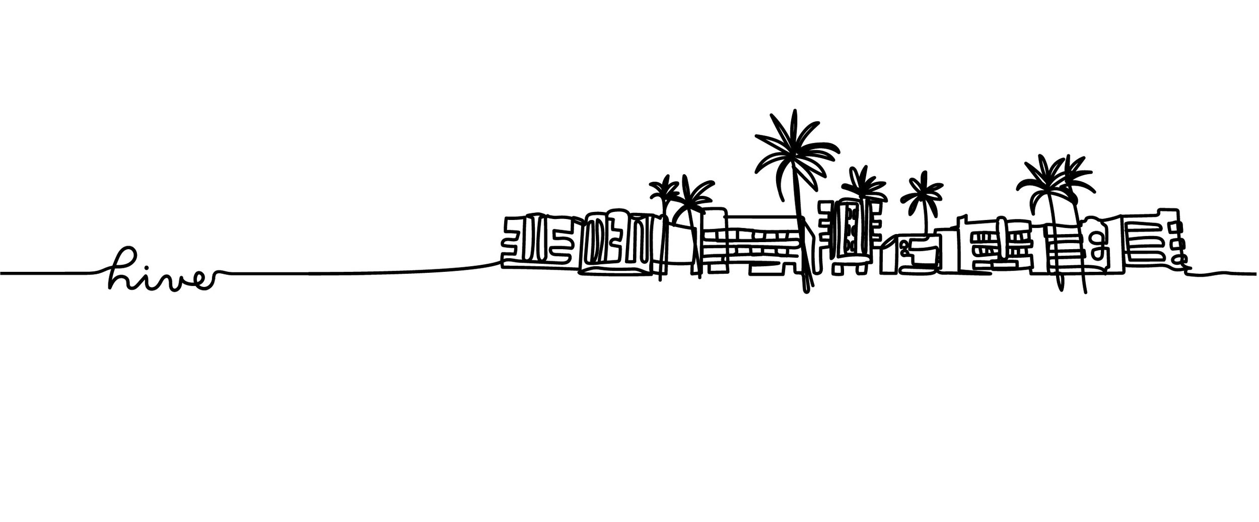
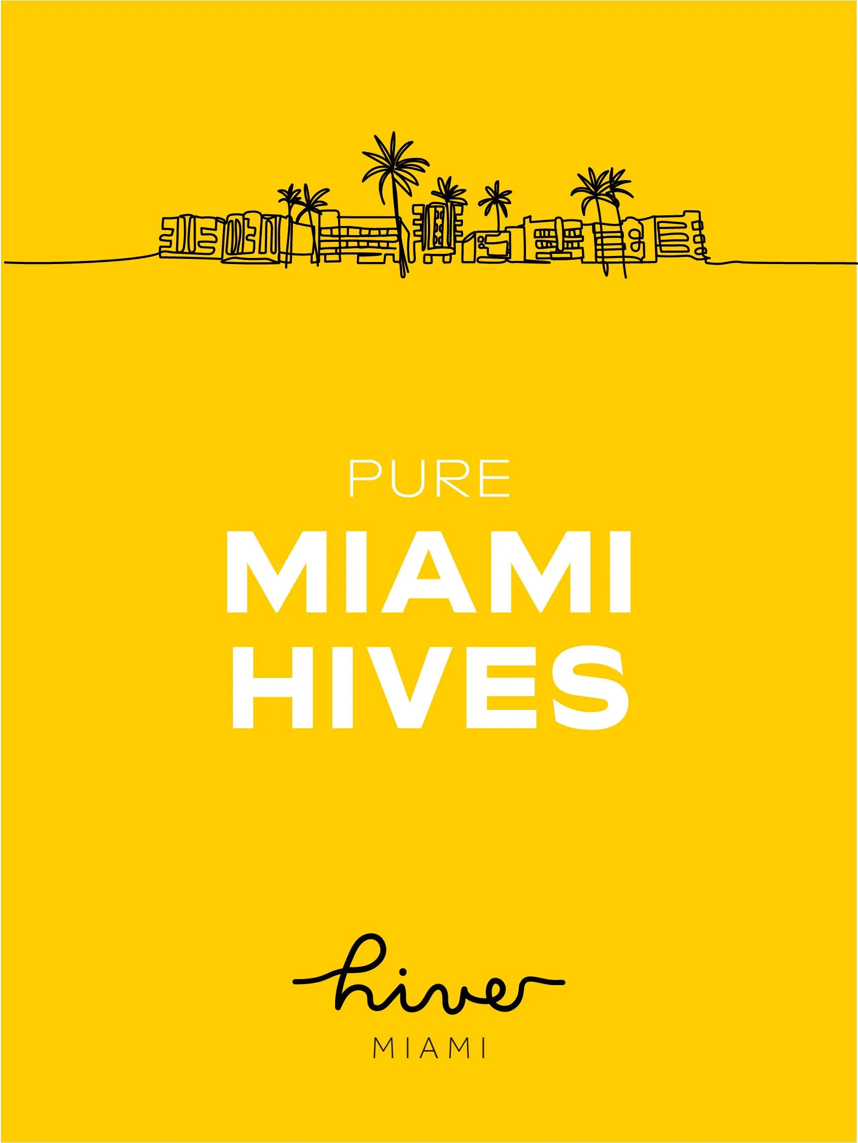
Visual identity and design language for a global creative department and in-house studios entirely dedicated to Bacardi brands, operating in London, Hamburg and Miami.
BRIEF:
Bespoke Bacardi social studios deliver global brand strategy at a local level. The ambition is to deepen connection between brand ideas and customers through listening and localised brand behaviours on a local level, overseen by a global management team.
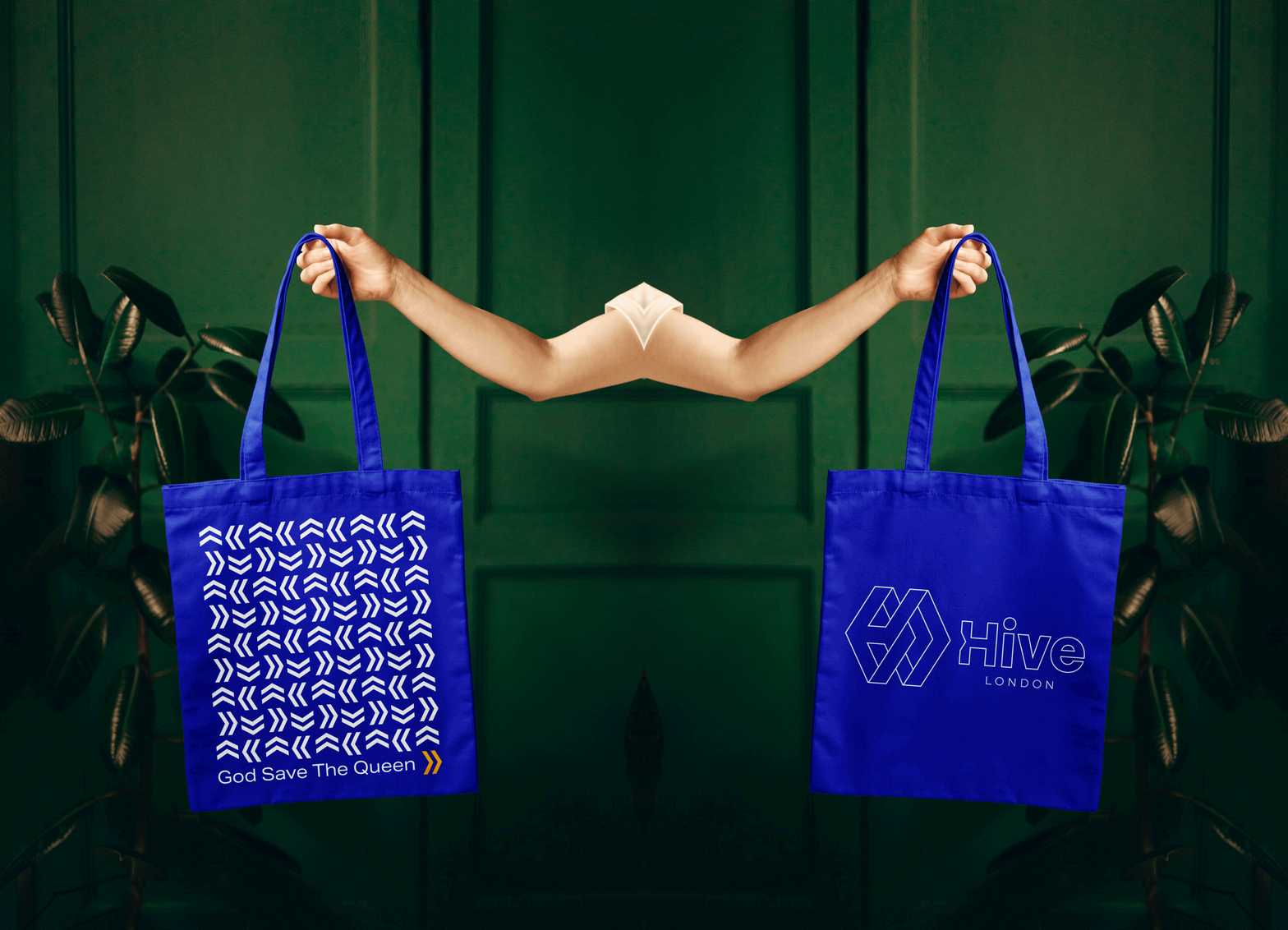
They asked me to design an identity that visually represents the idea of connectedness while maintaining modularity, visual language and to design departments key documents.
WORK:
As a lead creator on the project I came up with 6 different concepts over 5 working days in total, exploring every possible angle from funky to corporate.
DELIVERABLES:
Let me take you back to the drawing board, and show you some reasoning behind the final concept. Since HIVE was a client-approved name, the connotation to honeycomb, bees and honey was quite obvious, yet I didn’t want to be cheap in its execution or give someone a design deja-vu.I looked at the hexagon from a different, isometric, perspective.
HONEY AND TETRIS. WHAT?
Let me take you back to the drawing board and share some reasoning behind the final concept. Since HIVE was a client-approved name, the connotation to honeycomb, bees and honey seems quite obvious innit. Yet, I didn’t want to be cheap in its execution or give someone a design deja-vu.
I borrowed the hexagonal shape, one of nature’s primary shapes, as a building block for this concept, and literally looked at it from a different, isometric, perspective.
The stackable and buildable structures felt in-line with the ask for modularity and connection between studio locations, while acknowledging them as separate units too.


